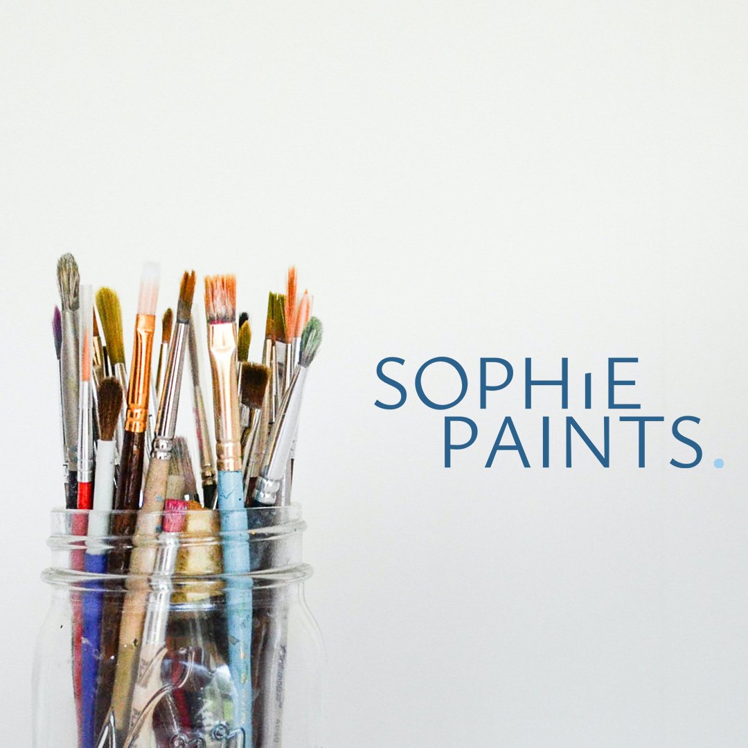
sophie paints
Brand identity | print design | brand photography
The Brief
Sophie Paints approached us to create a distinctive brand identity that reflects their unique artistic vision and the quality of their art. Sophie’s art has been described as both chaotic and calming, embodying the duality of her journey as an artist. She wanted the brand identity to capture this dynamic contrast while emphasizing the creativity and innovation behind their work.
the challenge
Our challenge for the Sophie Paints brand identity project was to effectively encapsulate the duality of Sophie’s artistic journey—both chaotic and calming—within a cohesive visual identity. Striking the right balance between these contrasting elements required a nuanced approach. Additionally, we needed to ensure that the brand identity resonates with a diverse audience, from professional artists to DIY enthusiasts.
the result
The outcome of our collaboration is a striking brand identity featuring bold, expressive fonts and a sophisticated palette of blue tones that embody both the calming and chaotic elements of Sophie’s art, adding depth and creativity to the overall design. Our partnership extended to include luxury print designs and brand photography, highlighting Sophie’s work in a manner that underscores the quality of her creations. This holistic approach not only elevates the brand's visual appeal but also effectively conveys the passion and innovation driving Sophie Paints, establishing it as a distinctive choice for art enthusiasts.


“Hayley, not only did you create my brand from zero ideas from me. You also know have created me the most gorgeous photo collection for my website and content and the most stunning authenticity cards.
You always keep me in check, making sure brand is forefront and you’re SO full of ideas.
You’re a dream x
